Owner operator land
-
Client
Owner operator land -
Services
Logo -
Year
2018
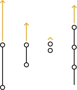
When creating a visual solution to the brand, we wanted to minimize long name OWNER OPERATOR LAND to the abbreviation OOL and fix it in the minds of people in the form of a symbol that represents the letters O, O, and L stylized as a route on the map. Also, the letter L is inverted in the form of an arrow associated not only with the direction of movement but also with the tip of the spear, symbolizing freelance.
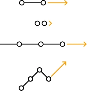
An important feature of the logo is its scalability and flexibility. As the truck makes its route on the map, the logo can also change depending on the device or object on which it is used, while maintaining maximum brand recognition. Logo lines can be lengthened or even disappear, making it as compact as possible. Depending on the trajectory of the lines and the number of circles indicating points on the map, the logo geometry may also change. As a result, it can become part of any infographic or decorative element of corporate identity.
Logo

Free space
Logo usage
Logo transformation

Visualization
