Diesel power truck center
-
Client
Diesel power truck center -
Services
Logo -
Year
2018
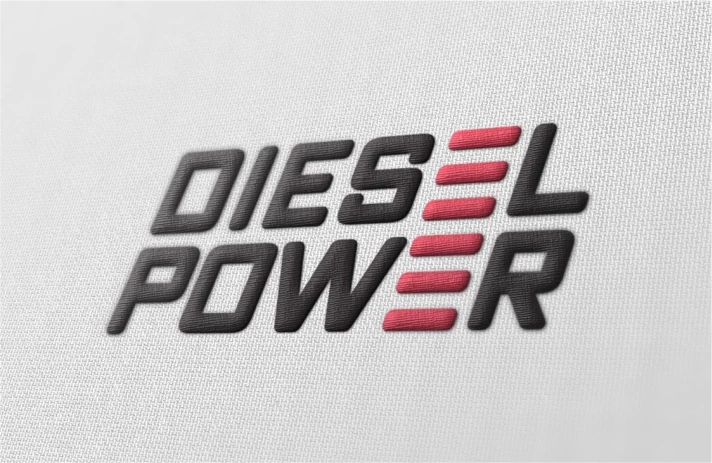
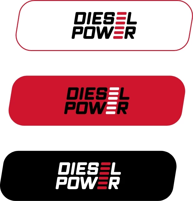
The “Diesel Power” Logo was uniquely created with the intention of easy visual identification and brand memorability. Throughout all published marketing material, from business cards to branded vehicles, the Diesel Power logo is easily recognizable and is an important factor in establishing brand consistency.
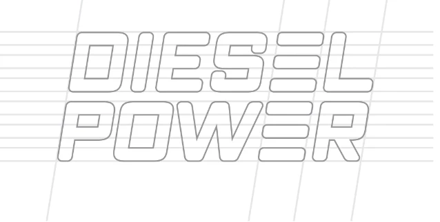
For Diesel Power, it was important to reflect the main objective of the brand, “Maximum Power, Maximum Charge” in the logo, and we were able to achieve that seamlessly. The logo is composed of the two words that make up the brand name in an oblique font. Both “Diesel” and “Power” are situated one above the other, with the letter “E” from both words being aligned. In designing this logo with the letter alignment, the “E” in both words was incorporated to create a stylized full charge indicator to symbolize the “Maximum Power, Maximum Strength” that this brand has established as it’s main objective.
Logo
Formation
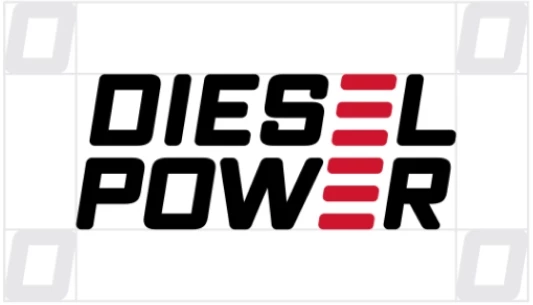
Free space
Logo usage
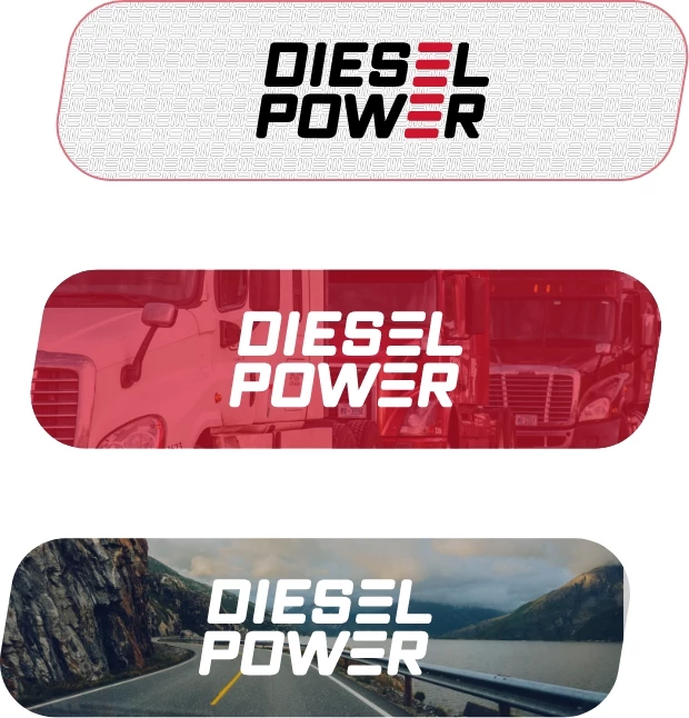
Visualization
